Olympia Time

History, politics, people of Oly WA

Page 12 of 174

Renters are nice people and other thoughts on the demagoguery of the Missing Middle

Missing Middle from AIA Austin

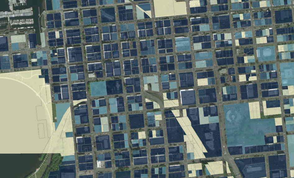
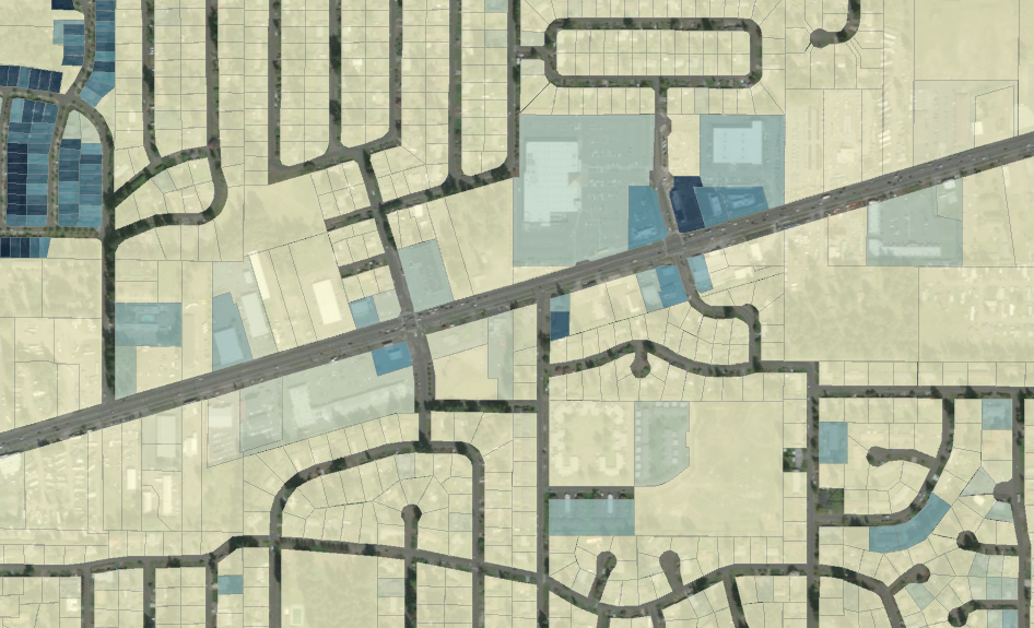
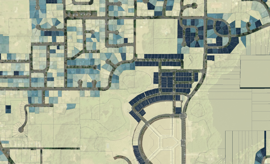
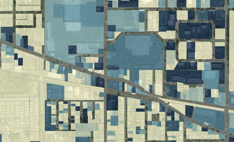
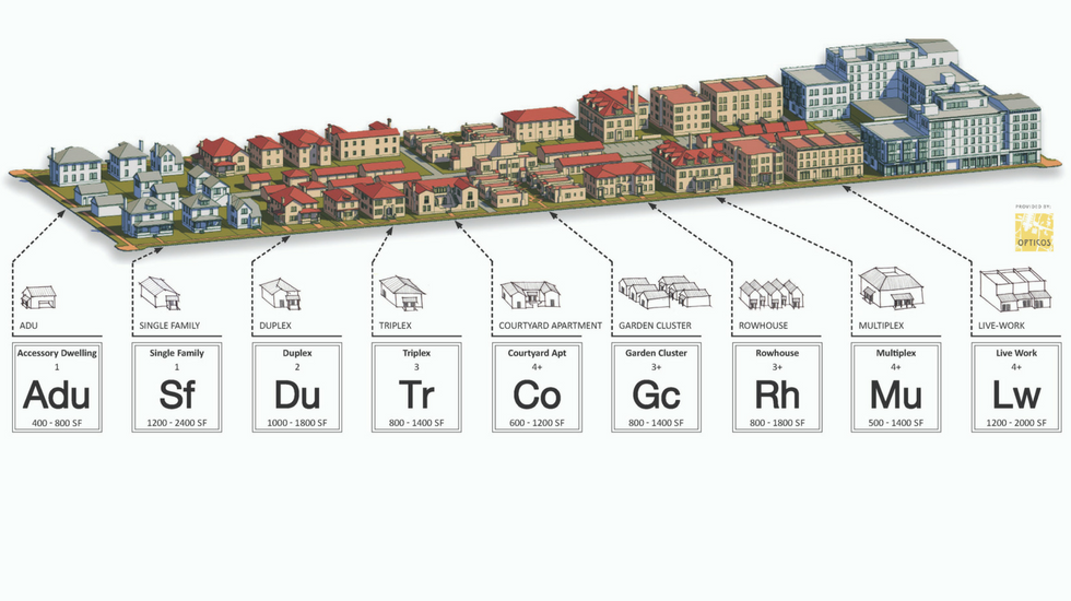
Right now the Olympia planning commission is considering a list of recommendations about the so-called Missing Middle. These recommendations would hopefully increase density in Olympia’s least dense neighborhoods by allowing duplexes, townhomes, courtyard apartments and ADUs in the mostly the upper elevation swaths of single-family homes neighborhoods.

As you would expect, there are a bunch of people who are not fans of this idea. And as you might expect, they belong to existing neighborhood organizations in well established (but I would argue not traditional) residential neighborhoods. As Whitney Bowerman argued in this excellent email she sent to the planning commission, these organizations represent mostly older homeowners who want to preserve the low-density character of their neighborhoods.

This testimony to the planning commission I think almost perfectly encompasses this attitude.

First off, she makes a point that we shouldn’t follow the example of Seattle. Implying that by increasing density you don’t do much to decrease housing costs. The fact is that rents and housing costs have started to decline in Seattle, mostly because of all those cranes on the skyline are starting to make a dent in demand.


Renters are not bad, I’m a renter

About two minutes into her testimony, she starts to get into a caricature of homeownership. “For generations, working people have dreamed of owning a house,” she said. Specifically a house, and in her mind, a detached single family home. Which is also a specific type of home that hasn’t been historically accessible to many people or even now.

“It is not just a financial investment, it is an emotional investment and a social investment as well,” she said. Apparently, when you own a home, your emotions should matter more and your memories are deeper and richer.

“Outside those walls and over the fences, they (homeowners) create social networks,” she said. “Perhaps not in the days of old when someone was home and could build social capital in the neighborhood, but people do participate in Nextdoor, attend annual meetings… they are literally invested in their neighborhoods.”

This is all a slam on the nature of renting a home. Personally, I’ve done both. I’ve rented in almost every quadrant of Olympia and owned two homes in East Olympia. Currently, I rent an apartment in Southeast Olympia and hope one day to own again, but not a single family detached home. My goal is a townhouse with as little yard as possible.

But this belies the philosophy behind this anti-density testimony. The neighbor I had that called me a piece of shit while I was outside with my toddler owned his home. He still owned it when the police arrested him for waving a gun at his wife. I’m sure he had memories in my neighborhood, but they weren’t more meaningful because he paid a mortgage.

I’ve also had a series of neighbors that have quickly moved in from out of state, bought a home and relatively quickly moved out without making a dent in my community. They were not literally invested in anything and their presence, while pleasant, did not have a deeper impact on the neighborhood.


It isn’t about renters vs. homeowners, it’s about density and affordability

I agree the research indicates that homeownership by-in-large means better things for a community.

The testimony is also moving the ball from a debate on increasing density in Olympia’s low-density neighborhoods to a debate over the value of homeowners vs. renters. At least in the examples of townhomes and possibly courtyard apartments, the Missing Middle will be the only actual path to homeownership that some people can ever use. And, the option of duplexes and ADUs will possibly allow some folks, who would like to set down permanent roots in a neighborhood, stay in a neighborhood.

Imagine for a moment a single mother who got a late start on retirement. She has an addition in her small home that she can easily transition into an ADU if it was allowed by the city. That would keep her in her home past retirement.

Currently, a lot of neighborhoods in Olympia fail the test of liveability in two major ways. They are too low density to really be considered walkable. Even if a small neighborhood center like Wildwood did want to located inside some of these neighborhoods, it wouldn’t survive because single-family neighborhoods simply aren’t dense enough.

Also, we fail in terms of variety of housing types, especially in the car-dependent SE neighborhoods. A good neighborhood ensures that multiple generations of the same family can live in the area, that people from a variety of backgrounds can come together. Large swaths of single-family homes, while protecting the nature of a neighborhood, does not promote diversity.

If you work outside Thurston County, you’re more likely to not like downtown Olympia

The city of Olympia commissioned a public opinion poll in December. The poll mostly covered concrete things like how important various city services are and how well they’re being delivered.

But the survey also got into an interesting line of questioning about how residents perceive safety in Olympia. The pollsters asked whether we feel safe in our neighborhoods during the day and night, and more important, how we feel downtown during the day and at night.

Here are the totally unsurprising results:

Most people felt most safe in their own neighborhoods, and then less safe in Olympia in general and then even less safe downtown and especially at night. There were several groups that drove down the results for downtown. If you were from the Northwest neighborhood, if you thought the quality of life in Olympia was low, if you only had a high school education or if you worked outside of Thurston County, you feared downtown more.

The last one is the one that I’m most interested in exploring. If you commute outside of Olympia on a daily basis, I’m going to assume other things about you. You probably also shop in between home and work. Which likely means that at best you do most of your shopping on the Westside, but more than likely you shop in Lacey or in Tumwater. Your daily habits are tied to the freeways your commute doesn’t take you downtown.

Here’s an interesting tidbit, 17.2 percent of Olympians commute outside of the county for work, according to the American Community Survey. This is up from 16.9 percent in 2015, but the census bureau has only asked this question in the last two years. If you take commute times though, 22.8 percent of Olympians have a commute over 30 minutes. For most people, I’d assume this takes them out of the county, but at least well outside of Olympia so it might as well be out of the county. And, this number took a significant jump between 2011 and 2013 when it went from 18.8 percent to 22.8 percent (it’s remained steady since then).

This wrinkle with long-distance commuting and downtown combined with another result of the city survey makes me think that familiarity of Olympia is a leading indicator of how people perceive their own safety. Literally not one of the survey respondents said they feel very unsafe in their own neighborhoods during the day.

So, what does this mean for governing Olympia? A good majority of the complaints about downtown come from people who are obviously not familiar with downtown. They are fearful about downtown, but I doubt very much that they’re even downtown at night. Is it the responsibility of the city to govern in the direction of unfamiliarity with reality?

As neighborhoods go, downtown Olympia is pretty valuable

One of the most incredible things happened last week. The Thurston County GeoData Center released a huge swath of datasets that had previously been prohibitively expensive to access.
All the datasets are available to download, and if you have your own GIS application, you can play with them there. But with a few of the datasets, you can access and play with directly. One of them is this dataset in particular that puts together a lot of information about parcels in Thurston County. Including total acreage and the total value of the parcel.
By comparing value and acreage, you can really see where the most value is in terms of Thurston County neighborhoods. Downtown Olympia, seen here in mostly deep blue, is generally pretty valuable to the county’s bottom line. These tightly developed blocks are fairly consistently assessed at a high value.
When you get out to the Capital Mall area, the colors become less pronounced. There are still a few deep blue parcels, but the mall itself is a lighter shade of blue and its surrounding commercial developments are getting yellow.

When you get out on Martin Way, really the only highly valued property is one brand new commercial building.

The same is in Southeast Olympia, where the highly valued properties are newer, nicer homes or actual newer “missing middle” townhomes.

You see the same pattern in interior Lacey, where parking lot developments like the South Sound Mall and Fred Meyer are less highly valued than smaller parcels in Lacey’s adjacent “downtown.”

I made a similar point earlier using anecdotal evidence comparing a downtown block with a similarly sized parcel on the Westside.  When you make the same analysis using businesses next door to each other (but only in Tacoma, not Olympia), the result is the same. 
Traditional development is more productive than development that prioritizes car infrastructure. 

When you compare traditional, non-car centric, blocks to parking lot dominant commercial development, the traditional blocks are always more valuable. They provide more to the community. The video below points out that the blocks in downtown Olympia are a lot like the blocks that we’ve built in cities for thousands of years. These are the dense, easily walkable blocks that have only become rare in communities that were built in the last 60 years. Only newer cities like Lacey lack them at all.

A map of Lacey that you can’t unsee

Take a close look at this map:

What do you see?
This map is from a page buried deep in the city of Lacey’s 2017 State of the Streets report. I took a look at the report originally because I was looking for data on pedestrian accidents. Which, by the way, are collected by the federal government, but are also very hard to work with.
Anyway, I found this map and had an immediate head-smack moment. What I saw totally blew me away.
Can you see it yet?
Now take a closer look:

I zoomed into the area around where Martin Way crosses underneath I-5 between College and Carpenter Roads. City-owned roads on this map are black (residential), green (arterial) or red (collector). The gray roads are not city-owned.
According to this map, Lacey is essentially two cities.  

In the Southwest corner of the map, you have the (mostly) original core of Lacey that existed near when the city became a city in the 1960s. This area is a collection of neighborhoods and commercial strips south of Interstate 5. This was essentially the bleeding edge of suburban development from Olympia that wanted to be on its own.
The Northeast Corner of the map is is everything that was annexed into the city beginning in 1985. This is generally what we call today Hawks Prairie. It was historically Hawks Prairie too, of course.
But, these two parts of Lacey are not connected by Lacey owned roads.  The two roads that would connect Lacey together, Carpenter or 15th Ave SE/Draham, are owned and maintained by the county.
This makes total sense to me now, because the entire “loop around the north to annex around the older Tanglewild neighborhood” always seemed so blatant. So it made sense that you could easily drive from one part of Lacey to the other without traveling on city roads.  Just go down Martin Way.
But, before I saw this map, there’s no way I thought you couldn’t, in fact, drive on city roads to get from one end to the other.

Lakewood was not built for walking

This town was not built for walking
It isn’t the trains that make pedestrians unsafe in Lakewood. Like a lot of cities that were built primarily in the era of car-centered infrastructure, Lakewood is not particularly walkable and a lot of people end up getting hurt and killed because of it.

Since the Amtrak derailment at Dupont a few weeks ago, a new focus has been put on the comments of the Lakewood mayor on how bad a new high-speed train route is to his city. His statement that someone is going to “get killed” was said without any sense of irony that five people already get killed walking around Lakewood each year.

Just pedestrian injuries (deaths notwithstanding) from cars have been steadily increasing in Lakewood for the past ten years.

Buried in Mayor Don Anderson’s column in the Tacoma News Tribune is the logic that kills so many people in Lakewood. He states bluntly that local rail was “made obsolete” by buses in the 1920s. In reality, it isn’t that small-scale or regional rail became obsolete, it is that investment and planning in low-density suburbs (like Lakewood) in the car era made local rail inefficient.

Even if you don’t believe that the car lobby bought out local rail lines to simply shut them down, there are broad historical trends that play havoc with Anderon’s obsoletion thesis. While suburbs began sprouting up in the early part of the 1900s, the spread of cars and federal transportation funding pointed towards cars led to the development of car-centric communities. Places to shop and work became displaced spatially from places to live and sleep. I don’t think there’s a serious person who can say that Lakewood isn’t an almost perfect example of this kind of suburb.

Trains are not obsolete, but they are ill-suited for suburban cities like Lakewood that were built around cars. But then again, so is walking.

Lakewood’s walkability rating is 39, which means that almost every trip you need to make from your home requires a car. Much of Lakewood, even the portions with sidewalks, is built for cars. Thin sidewalks with little or no division from long, straight roads the encourage traveling at a high speed. This is the kind of city design that leads to less walking and which also leads to pedestrian injury for those who have to walk.

From Next City:

Wide, straight lanes, for example, encourage people to drive faster, making neighborhood streets less safe for those walking. Cars are three times more likely to cause death when hitting pedestrians while traveling at 30 mph than at 20 mph. And when some of the population does not have access to transit or a car, making a street pedestrian-free isn’t a realistic option.

Lakewood at one point did have a local rail system connecting it to Tacoma. And you could argue that it was shortline rail companies like Pacific Traction that originally spawned suburban living in the Lakewood area. More well-off Pierce County residents could set up home around American Lake, and in an era without decent roads to Tacoma, they could still find a way to earn a living in the city.

But it was the glut of highway and road spending in the later decades that made that dream available to everyone and subsequently killed Lakewood’s streetcar company.

Pedestrians getting hurt and getting killed in Lakewood is fairly common. Pedestrian deaths aren’t newsworthy, mostly because they’re cooked into the city’s design. 

Regional rail transit is also hopefully going to continue to expand, despite the tragedy at Dupont. So, if Mayor Anderson wants to make pedestrians safer, he needs to look at the layout of his own town, examine why cars kill and hurt so many already and not blame the train.

Gigi McClure didn’t do well enough in Jeff Davis’ territory to win

Other than Renata Rollins winning a seat on the Olympia City Council, Gigi McClure doing so poorly is probably the most surprising result of the last election. Her military logistics background easily translated into an argument for an institutionalist kind of candidate that would bring peace to the port commission. From one angle she looked like a sort of proto Bill McGregor, whose decades in port operations across western Washington is the main element of his campaigns.

But, as McGregor seems to be squeezing out a close win in his race, McClure was beaten handily by incumbent E.J. Zita. While Zita herself had a close race against institutionalist Joe Downing Jerry Farmer (who is also this guy) two years ago, two years on the commission obviously gave her at least a small incumbents edge.

But, most interesting is the geography of where McClure essentially lost this race, where she did a poor job recreating McGregor’s map.

On this map, the darkest colors are where McClure did worse compared to McGregor. When you zoom in you see a lot of the same precincts that McClure did the poorest in compared to McGregor are the same ones that Jeff Davis won in against Sue Gunn four years ago. In the same way that McClure was the institutionalist against Zita, Davis was the institutionalist against Gunn in 2013.

Davis’ best precincts were in a band of suburban neighborhoods around the more dense areas in northern Thurston County, these are the areas around Yelm Highway and College that make a broad loop around the older parts of the county.

During the recent episode of The Olympia Standard, I made a quick assessment of why McClure didn’t match McGregor, but I’m not totally sure I was right. I said that her penchant to equate port protestors with terrorists probably didn’t play very well in the suburbs. I think this is still true and I’m also sure that Zita’s incumbency had some play in results too. But I’m expanding my thinking. I’ll let you know when I get back anything interesting.

2017 election lesson number 2: How the Oly Progressives boxed them in


This post will play off my last one where I talked about how the power elites (a term coined by Steve Salmi at Green Pages to describe non-progressive or transactional candidates) could not expand their geography after the August primary. What was the most important geography for the slate of progressive candidates in Olympia, especially compared to other recent progressive candidates?

Before I start (again), here is some deeper reading for you (again):


Here are all the spreadsheets and map I’ve been working from. The data is from only a day or two after the election, so as counts march on, things will change obviously. But in terms of making maps, I think these will more or less stand pat.


For further reference, Adam Peterson did some really great shapefile based maps that he posted to Thurston Progressives.

Marco Ross ran for mayor against Cheryl Selby in 2015. He is the most recent progressive candidate for city council and I’m using his results to compare to this year’s successful slate.

Literally, the answer to where they did better is: everywhere in Olympia. The smallest margin of difference between the average progressive percentage two years ago and this year was 14 percent. But even taking that into consideration, there is still a geographic story to tell.

So what I did with this map was isolate the top 14 of 57 precincts (in total) by how much better they did this year than two years ago:


What I see is a band of precincts above the SE Olympia core along the highway on the Eastside (extending to a couple on the westside. Then a series of precincts running up the spine of the upper Eastside and then a few out on the rim of the city.

Progressive candidates this year did do well everywhere, but where they did best was not in their core areas along the water or inside the SE Olympia bubble of their opponents. They carved out their greatest success between the two geographic powerbases along the interstate and then in far outside neighborhoods.

2017 election lesson 1: Olympia power elites really were boxed in

Where atmforcouncil failed

After Tuesday’s election, I did my typical copy and paste job on the precinct-level data and came up with a handful of lessons on local Thurston County politics. I talked about these maps in the latest episode of The Olympia Standard. But because visuals like maps don’t play well over the podcast, I’m putting them up here.

Before I start, here is some deeper reading for you:

Here are all the spreadsheets and map I’ve been working from. The data is from only a day or two after the election, so as counts march on, things will change obviously. But in terms of making maps, I think these will more or less stand pat.

For further reference, Adam Peterson did some really great shapefile based maps that he posted to Thurston Progressives.

Back in August, after some concern that the progressive candidates really wouldn’t have a good time in November, I predicted that “power elite” candidates like Allen Miller and Jeanine Roe (and likely Max Brown) wouldn’t be able to break out of their friendly SE Olympia neighborhoods to find a majority in November. By “power elite,” I’m borrowing a phrase coined by Steve Salmi over at Green Pages when he described the August results.

And, this happened because most of the places were Miller in particular picked up better percentages in November were places he already did well, as illustrated by this map.

Miller picked up more votes along the edges of town, places similar and including his SE Olympia power base. He lost support as a percentage throughout most of Olympia, towards the center of town in older, more walkable neighborhoods.

Compared to Brown and Miller, Jeanine Roe did better, but still not well enough to keep her seat. This map shows where she did better than Miller and Brown, which was slightly further in than the edge of town, making second ring neighborhoods more competitive.

The academic background of why you should hold a ballot party

On the most recent edition of the Olympia Standard (the local politics podcast I host with Dani Madrone) we introduce our ballot party challenge. Basically we want to get as many people interested in local politics to invite their non-political friends to a house party where everyone fills out their ballots.

On the surface, this is meant to be a fun, social way to get people civically involved. But there is a real world, political science backing to this challenge. I am convinced that ballot parties, especially in vote by mail states, can be the most effective tool to boosting local election turnout.

In Thurston County, turnout for local elections is depressingly and not-uncommonly low. In the last primary in August, Thurston County turnout was only just over 22 percent. That’s bad.

Study #1 Impact of media on local knowledge

In the past sixty years or so turnout in local elections has been decreasing nationwide. At least one paper I found attributes this trend to the influence of television on the local information system. In short, television has been forcing out local radio and newspapers from the attention span of media consumers. While television is good at covering national news and providing entertainment, it is horrible at doing what local radio and newspapers used to do, provide meaningful local coverage.

I’d also lump in the contraction of newspapers overall and the consolidation of radio ownership as well. Outside the influence of television, radio and newspapers aren’t doing the same work they used to.

But this doesn’t mean that informed people don’t exist. You may know some folks that know a lot about local politics. I mean, I write a blog and co-host a podcast. It is just a matter of getting those people together with folks who may not know much and therefore won’t vote.

Study #2 You’ll vote if you know your friends are voting


Or, if there is social pressure to vote, you’ll vote. In one of the largest studies on voting, researchers in 2008 figured out that when voters realized that there was social shame to not voting, it had an impact. They theorized that the decline in voting had a lot to do with how our political culture has changed since the 19th century:

From an historical vantage point, one could argue
that the sharp declines in turnout rates that occurred in the United States after the 1880s reflect social forces,
such as rapid population growth and mobility, coupled
with institutional changes, such as the introduction of
secret balloting and rules requiring that party officials
remain a long distance away from where ballots are
cast, that diminished both the surveillance of voters
and their sense that their voting behavior was being
monitored. Concomitant changes, such as the decline of
party machines, membership organizations, and party aligned
newspapers that openly excoriated nonvoters,
also may have contributed to the erosion of social pressure.

Heap on top of these trends the addition of vote by mail. While it made vote by mail much easier to vote than schlepping down to the Church of Christ, it also took away the last social aspect of voting we had.

Study #3 Big surprise, make voting fun and people will vote

More than direct mail, more than calling people on the phone. It was free food, music and family fun that drives up voting.

Researchers partnered with local community groups and Working Assets, a phone company that funds political campaigns, to organize and advertise Election Day festivals. In the week leading up to the elections, they advertised the festivals through local newspapers, fliers, posters, lawn signs, and pre-recorded phone calls. All festivals were open to the public, family friendly, and featured music and free food. The festivals occurred under large tents near polling places. While advertisements described the events as election festivals, attendance was not contingent on voting.

… 

Voters in precincts where a festival occurred were significantly more likely to vote than voters in precincts without a festival. Researchers estimate that in precincts with voter turnout of 50 percent—turnout typical in major US elections—holding an election festival would increase turnout by 6.5 percentage points. In precincts with a 10 percent voter turnout—typical turnout in precincts in this evaluation—election festivals are expected to increase turnout by 2.6 percentage points.

Based on these findings, researchers found that the festivals were a relatively cost-effective way of increasing voter turnout. The festivals increased turnout by 960 voters in total. Organizing and advertising for the festivals cost a total of US $26,630 (in 2006 dollars). This implies that the program spent approximately US $28 on each additional person who voted. If the baseline voter turnout had been 50 percent, the results suggest that 2,339 additional people would have voted and the per-voter cost of the program would be US $11. In comparison, research finds that direct mail campaigns increase voting by US $60 per additional voter and door-to-door campaigns cost roughly US$20 per additional voter.

Now, in this study, it was a polling place festival and we don’t have polling places in Washington State. Literally every kitchen counter is a polling place here. So, we devolve to the idea of a ballot party.

What’s a ballot party?

While if you google “how to throw a ballot party,” you don’t come up with very much, WEC Protects put together a timely one pager on everything you’d ever need to think of. But in my experience, ballot parties are pretty simple. You need to:

a) Do all the things you’d do to bring your friend together and have fun. This may include beer. Or pizza. Or music.  Or meet at a bar. Or whatever. I’m not your social director.

b) Make sure everyone brings their ballot. It’s like the price of admission.

c) Bring Pens. You. The organizer, bring pens. It’s like your one job. People will need them.

d) Bring knowledge. Voter pamphlets, your brain. That kind of thing.

e) Everyone fills out their ballot.

I wish there was a non-profit in town, or this was a regular aspect of campaign or party organizing. But it is not, at least yet. I’m hoping we get there.

For this round of voting, Dani and I are throwing down the challenge. Get your parties going and make sure your friends are all voting. But in the future for a vote by mail place like Olympia, I hope going to a ballot party becomes a regular staple of voting season.

Cascadia would have qualified for the World Cup

People are dealing with the USMNT crashing out of World Cup qualification in different ways. This is just one way, but it is my way. So, if you came here to criticize my back-of-the-napkin pining then just keep that in mind. This isn’t really a serious analysis of economics or world soccer. This is just me doing what I can to process the loss.

One of the most interesting books I’ve read in the past 10 years has been Soccernomics, a sort of Moneyball-centered book on world soccer. The authors attempt to boil down the essence of national team success to a handful of factors: total population, per capita income and experience in international soccer. While this doesn’t really explain Brazil (poor and really good) or the United States (big, rich and bad) very well, it does explain the difference between Germany and England.
Before I go on, a few notes:

As you might tell, I’m not going to go through the practice of listing players born or somehow connected to Cascadia (Jordan Morris! Kelyn Rowe! DeAndre Yedlin!) and making the bold claim that they’d beat Trinidad and Tobago. We all know they would have. Also I’ve done that before and that’s boring.
The map of Cascadia I’m using is not the bioregional one, but more of the Chile shaped one that Colin Woodard used in American Nations to described the Left Coast. I’m happier with this one, it seems more like a “nation.” And if you came here to tell me that I’m wrong, well, this is all made up anyway and this is my blog. I’ve done this before also.
So, back to soccer and bad math.

So, would a totally fantasy Cascadian Republic have qualified for the World Cup? Short answer: yes. Hurray! I hate you Bruce Arena!
Long answer: absolutely. But we would have had a hard time beating the rest of the United States and Mexico. 
So, first things first, I only took the countries that were in this year’s final qualifying round for North America (sorry Canada, punch your weight already) and added in Cascadia. For Cascadia I took all the counties on the west side of the Cascades in Oregon and Washington and added a bunch in California down to include most of the Bay Area (my map, my rules). I also didn’t include the Cascadian parts of Canada because even though they’d be part of my Republic, I thought why make the napkin more complicated?
So, population and per capita income were pretty easy to figure out once I decided on geography. 
In terms of soccer experience I decided on World Cup games played since it was the first metric I could find. For Cascadia I decided it would be easier to just average the number of games played of every other team. That seemed fair.  Also, in this fantasy world, Cascadia has had decades of independence and developed a strong league system with well-rooted club teams in nearly all their communities. And promotion/relegation Also, don’t tell me how this decades old history would have made my populations and per capita income figures meaningless. 
Then I just ranked the teams by each factor and averaged the rank. Total back of the napkin. And while the United States finished first in this ranking (grumblegrumblegrumble), Cascadia finished near the top, tied with Mexico. 

–>

Average Rank Population Per capita income Experience as WC matches played
United States (-Cascadia) 1 308,660,798 58,030 33
Mexico 3 124,574,795 17,740 53
Cascadia 3 16,452,729 34,751 18
Costa Rica 5 4,919,202 15,750 15
Honduras 5 9,308,042 4,410 9
Trinidad and Tobago 5 1,370,111 30,810 3
Panama 6 4,116,683 20,990 0
This Cascadian Republic is bigger than any of the Central or Caribbean countries and also richer per capita than anyone except the United States. It really did surprise me how much poorer per head Cascadians would be than USers. But our mediocre size and better than average wealth and average experience put us right up there with Mexico.
Mexico, who actually finished at the top of the qualifying group this year. But I’m sure Cascadia would have given them a run for their money.
« Older posts Newer posts »

© 2025 Olympia Time

Theme by Anders NorenUp ↑