Last month I put up a couple of posts featuring maps that explore population growth in Olympia over the last decade.
The first map showed the uneven distribution of population growth across the city. The second map took a look at the change in the percentage of white people in the last ten years on the neighborhood level.
I was thinking about the second map today and realized I may have done a disservice by using change in white population to properly illustrate change in race. It is true, Olympia overall has gotten more diverse in the last 10 years. The white population has barely budged from 38,000 (around 82 percent in 2010) to around 39,000 (75 percent in 2020). At the same time, the black population has increased from 931 (2 percent) to 1,340 (3 percent).
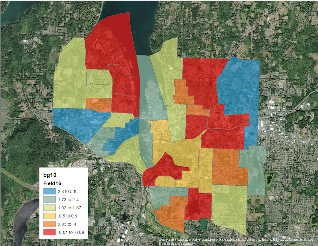
But it is important to note where that population increase has occurred. In fact, in some neighborhoods, the black population has decreased in the past 10 years, while the black population citywide has increased.
The most growth seems to be in neighborhoods I’ve discussed before. For example, I am not surprised at all that block group 105.1 (the blue section in the bottom left of the Westside) showed a large increase in percentage of black residents. The far Eastside near St. Peter’s also doesn’t surprise me.
All the neighborhoods marked in red saw a decrease in black population. These neighborhoods follow the same trend as the previous map on population growth. The neighborhoods that didn’t grow in the past 10 years also saw a decline in black population.
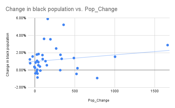
Again, there are outliers, but the relationship between the population increase in neighborhoods and the change in the number of black people living there is real. Here is population change charted against change in black population as a percentage:
2020 marked the close of the last decade of a long-term experiment we played in Olympia. We closed off growth in many Olympia neighborhoods beginning in the 1980s by systematically downzoning predominantly older, single-famly home neighborhoods. This was to prevent the spread of multi-family housing and the creation of “ghettos.” The Housing Options Plan passed right after the census data was collected largely reversed these downzones city-wide.
You can find my data sources in the posts below. Here is my crosswalk file for this map.


Leave a Reply