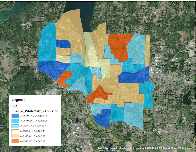
Every single block group in Olympia declined in the percentage of “white only” respondents. This isn’t saying a great deal. Olympia’s most diverse neighborhood is 62 percent white, it’s least diverse is 90 percent white.
Taking Thurston County’s rate of diversification (going from over 80 percent white to just over 70 percent) as a measuring stick, I was able to rate Olympia neighborhoods. Neighborhoods in the map below in a shade of blue diversified more than Thurston County, in orange, less than.
Taking the map from yesterday, there seems to be fairly strong correlation between neighborhoods that did not grow in the past 10 years and retained their lack of diversity (when compared to the rest of the county).
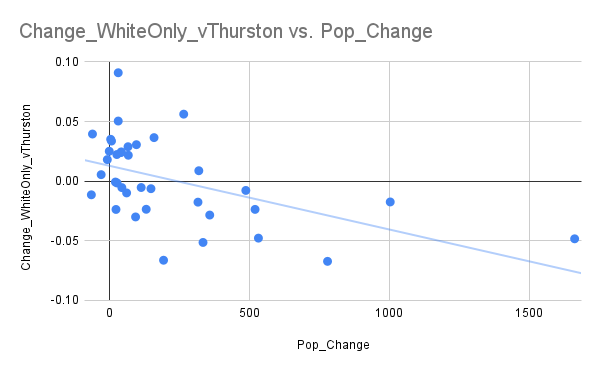
In fact, when you take the raw data (population change vs. racial makeup change), you see a trend towards neighborhoods that grew less staying whiter.
There are definitely some neighborhoods that run counter to the trend. But, citywide, the neighborhoods that grew were the ones that became more diverse.
I included technical notes in my previous post on population growth by neighborhood if you want more information about how I got here. I did though update my crosswalk document to include the race data that I used in this post.


Leave a Reply