1. Sanders won the Sheriff’s race leaning on urban voters, but…
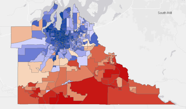
Here are Sanders’ results in raw numbers. Blue he did better, and red worse. This is the prototypical Thurston County partisan map. Democratic candidates tend to do better and run up the score in the urban areas, and try to tamp down their losses in the rural precincts.
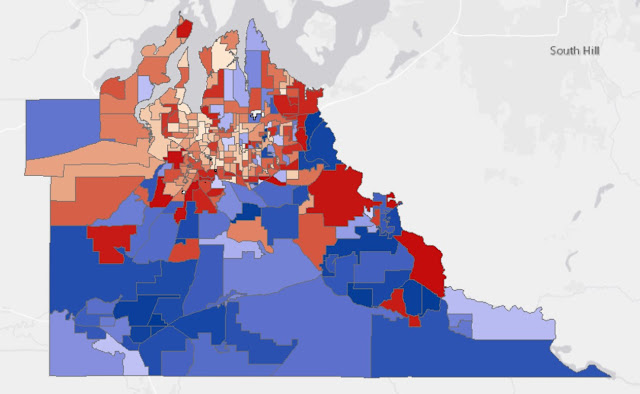
This is the map of taking Sanders’ percentages and taking away partisan ballot headliner Senator Patty Murray. What this map shows is though Sanders used the core of Olympia, Tumwater and Lacey to beat Snaza, he underperformed the top-of-the ticket Democrat to do it. Importantly to his win, he outpaced her in the rural areas.
Most importantly (and I think key to his win), there is a band of precincts close to the urban growth boundary where not only did he win the majority of the votes, but he outpaced Senator Murray.
2. The proposals to expand the county and port commissions passed, but exposed differences in opinion between the two bodies.
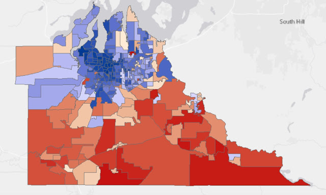
First, the results from the county proposition:
And then the thinner, but also successful map, for the port. Same pattern, same broad victory. Just, thinner.
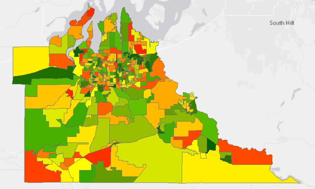
Both of the maps show the same general pattern we usually see, urban Thurston County voting one way, and then the further out of town you get, people vote another. What I was always curious about in this race is where the county did better than the port and vice versa.
In the map above, green areas saw more Port support vs. the County. But because the port was underwater vs. the county in all but half a dozen precincts, most of the green precincts are places where the county actually pulled more votes. I just did it this way to show variation. Doing it plus/minus 50 percent for each just showed a lot of pro-county areas.
It is an open question whether these results are more about the county’s reputation or the ports. But it is worth pointing out the cluster of green precincts (pro-port or anti-county) around Hawks Prairie and the Yelm area.


Maps without legends aren’t worth a whole lot. You can make a continuous value shaded map any color you want it to be by messing with the value range a given color represents.
I agree with Anonymous… This is sloppy work and the narrative doesn't identify which of the specific elected offices that is being referred to but blurs them together in confusing ways. The posts on this blog keep getting worse and worse.
Anonymous comments aren’t worth a whole lot, IMO… and Deane, I look forward to your website where you show us how it’s done. Personally, I can understand the maps and narrative just fine… maybe it’s a comprehension issue. The local community college probably has courses that can help you learn to read gooder so you don’t get confused and frustrated by simple things and don’t have to respond by tearing down somebody who provides value to our community every day, and has for YEARS.
Thanks, Emmett. You’re really awesome. Don’t let the bastards grate your skull.
Nice one Rob… Great to see how you celebrate Thanksgiving by insulting someone with a Master's in Public Adminstration degree about their "comprehension" of vote tallies. There's actually a standard protocol for sharing this information and Emmett and you clearly never bothered to learn what those standards require.
Maybe instead of insults you'd like to do something productive and explain what the color coding without a legend is supposed to mean? Maybe also you could explain how the same map has a narrative that conflates senate voting demographics with county sheriff voting demographics?
If someone had provided these maps with this explanation in grad school the first thing our professor and cohort would of asked, is when they expect to complete their draft document so it's ready to be shared.