Just about a year before the Seahawks finally took the field, they were in a somewhat similar position as the Washington NFL franchise is now. The logo the Seahawks had been handed by NFL designers didn’t directly borrow from local tribal design standards. The King County Arts Commission complained that it “fails to accurately depict the art principles of Northwest coastal Indians.”
From the Northwest Indian News (a newspaper) in September 1975:
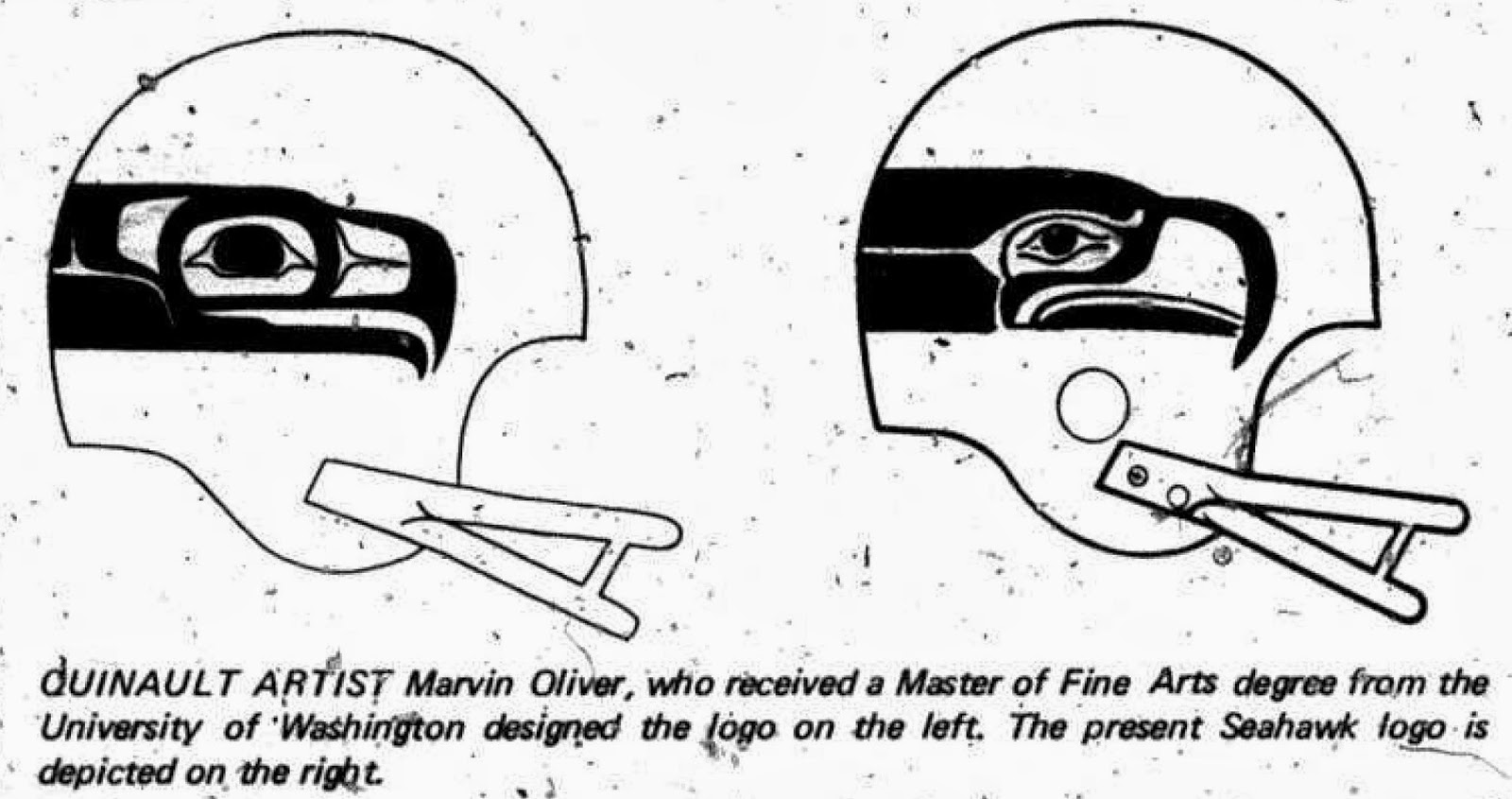
Among the differences found to be inaccurate is the characteristic eye form. The Commission enclosed a suggested correction by Marvin Oliver, Quinault… Oliver depicted regional art principles in the design.
It shouldn’t surprise me at all, but the original Seahawks design came from people working out of Los Angeles. I kid you not. I can just imagine the designers in the LA spring, cracking some books on Pacific Coast tribes, copying down ideas.
(Seahawks general manager) Thompson said the NFL firm did refer to some books on Northwest Indian culture. “Our intent was to follow the Northwest Indian culture, but there was no condition placed on them (NFL) in designing.”The Arts Commission further stated, “As with all great art, a full understanding and appreciation does not come quickly. Hence it is not surprising that the new logo fails to depict with adequate sensitivity the arts principles of the Northwest coast Indian peoples.”
Since that first season, and the back-and-forth between the commission and the team, the logo (especially in the eyes) has strayed even further from Oliver’s suggestions (from From Rain to Shine).

Native Appropriations brings us to the today, nearly 30 years into the Seahawks design. The blogger, a tribal member and law student, is writing about a particular use of the Seahawks logo that incorporates even more tribal designs. She like it, but examines where it fits in culture:
…I question my endorsement after my analysis naturally evolves into
larger questions about art, identity, acceptance, and what happens when
Native cultures live harmoniously (or at least not so adversely) with
others?Where we start to move away from imagery of a fan’s foam head towards a
fan’s headdress or mask is the face: the two green paint lines on the
cheek suggest the 12th Man is wearing “war paint” instead of mimicking
the black grease or tape the players use on their cheeks to cut down on
glare. Now it’s starting to look more like a hipster appropriation and
misinterpretation and I wonder – was the inspiration for this design a
transformation mask?
I’ll link again, because it is worth reading this entire post.


Great blog here! after reading, I felt pleasure arts sports hobby in Ghana on Oxglow
awesome blog